A tutorial on expandable post summaries is available on Blogger Help. If it doesn't work you might have forgotten to enclose the code with <style></style> before placing it between the </b:skin> and </head>.
Now if it works, you may find, to your disappointment, that all of your posts now have a Read more! link whether the post was truncated or not. A work-around this is by adding a snippet of code that shows the link to posts with specific labels only.
Let us say that most of your long posts are news articles under the news
label and the short posts consist only of site updates. To create expandable articles with the label news, insert the following code between <b:if cond='data:blog.pageType!= "item"'></b:if>.
<b:if cond='data:post.labels'>
<b:loop values='data:post.labels' var='label'>
<b:if cond='data:label.name == "news"'>
<br/><a expr:href='data:post.url'>Read more...</a>
</b:if></b:loop></b:if>
What the code does is that it checks if the post has a list of labels, then it goes through this list. If the label news is found in the list, it prints the link.
Follow the Blogger tutorial, use the code above instead to be placed in the body and change news to any label you want the link to appear in the posts.
Another version is to show the Read more link in posts by a specific author. To do this repalce the conditional statement above to:
<b:if cond='data:post.author== "name"'>
<br/><a expr:href='data:post.url'>Read more...</a></b:if>
Change the name to the specific author.
That's it!
Read more...
2007-07-24
Adding a Read more link to posts with specific labels
2007-07-03
Blogger skin tutorial
 Customizing the new blogger is easy since everything you'll need to change is in the style sheet (no need to edit the widget code). To give you an idea here's an overview on how I do it: I create the design (as an image) with the layout in mind in photoshop, slice it , save it and upload it. Then I go through my css code and make the necessary modifications. I change the width and height of the divs to match those of the images then set the images as background to these divs. Finally I do a little tweaking by adjusting the margins and paddings of the divs to fit the images together.
This tutorial is for those who want to use the widgets (and not revert to the classic template). Note that a background in css is needed. For this tutorial I will be using the Denim blogger template as a sample.
The layout..
Before we apply images to our template, we must first understand how our template is structured. In the css code you will find the labels (or id selectors as they are properly called) #outer-wrapper, #content-wrapper, #main (sometimes #main-wrapper), #sidebar (sometimes #sidebar-wrapper), #footer-wrapper, and #blog-pager. Find out how they are layered under the <body> tag.
Going over the <body> tag we will find that the Denim template has the following layout: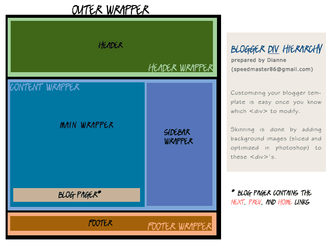
*blog-pager contains the next, prev, and home links.
Now that we know the layout, there are two ways we can proceed in making a blog skin. We can either define the width of the template then create the images with the same width in Photoshop or create the images first in Photoshop then set the width of the template accordingly.
The first method is for those who want a simple skin with a banner and some accents like what I did in my other blog. The second method is for those who want an image-heavy layout.
The skin...
In photoshop, create a new document whose width is the same as that of the template (or you can set your own width) and an appropriate height that will allow you to view the whole layout.
Create patterns or texture for the whole page, a banner for the #header, and some accents for the #main, #sidebar, and #footer. Play around until you are satisfied with your design.
Flatten the image and using the slice tool, create selections that will be used to skin the divs. For patterns, select a small portion of the pattern such that when tiled, it will create the same effect as the original. For those with solid background, select only the accented parts.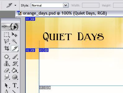
After all the selections have been made, we can proceed to optimizing our images for the web. This is very important step because it will reduce the file size of our images without compromising image quality for a faster loading time.
To optimize our images, under File, select Save image for Web....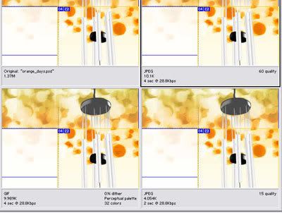
(I'll expound on this next time)
Finally upload your images to the web.
The code...
We will be changing the css code a bit.
» For #content-wrapper, #main-wrapper, #sidebar-wrapper, and #footer set all paddings and margins to zero.
» Assign the total width to the #outer-wrapper. This will give us control over the whole layout. The width can either be in pixels or percent. Usually, the percentage is used for fluid layouts, or layouts that stretch or compress according to the width of the browser window.
» Divide the total width between the #main-wrapper and #sidebar-wrapper. These widths can also be in pixels or percent.
» Don't assign widths to the #header-wrapper, #header, #content-wrapper, and #footer.
» Notice the space between the #content-wrapper and #footer-wrapper, to remove this, add a border to the #footer.
» If you assign the #content-wrapper a specific color different from the #main-wrapper, you will notice the unequal heights of #main-wrapper and #content-wrapper. To remove this find the #clear div just below the #content-wrapper and above the #footer-wrapper, and erase the text inside the div tag. Remember we are using xhtml here therefore tags without content (such as linebreaks) should be closed as shown.
<div class="clear" />
When everything fits nicely then only can we apply the images to the div.
For each div I mentioned above, find the 'background' property in the css code and change its url to the image corresponding to that div. Change its height and width to fit the image.
#main {
background: #fff url("image url") no-repeat top left;
width:450px;
}
Change its values accordingly. Set the background color to transparent or to the hex value of the solid color. For patterns, set it to 'repeat', 'repeat-x' or 'repeat-y' whichever is appropriate, otherwise set it to 'no-repeat'. Change also the position, whether 'top left' (or right) or 'bottom left' (or right), whichever is appropriate.
Tweaking...
This is the most important part. Adjusting the margins and the paddings may lead to disaster if you're not careful. Your site might look good in Firefox but a mess in IE (which is bad since a large percentage use IE browsers). Don't worry, we already did a little tweaking earlier so we only need to do a little more. To guide you, here's a general rule of thumb:
» Width and padding or border should not be assigned to the same div because some browsers (i.e. IE 6 and below) interpret widths differently. Instead of adding both padding and border to the width (of the content), lower versions of IE subtracts the values of both from the width resulting to a smaller content width. To avoid this, container divs are recommended (e.g. #header-wrapper) to carry either width or padding and border.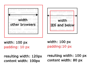
Important! Don't forget to preview your site in IE (if you're using Firefox).
I'll add more tips next time.
Hmm..I think that's all for the mean time. ^^
*edited on July 22
Read more...